
First, apologies for the long break.

Source: Khalil Bendig, http://otherwords.org/climate-change-we-can-believe-in/
So, do we have a problem with a global warming? Pretty much everyone agrees that the world has warmed, and 97% of climate scientists agree that humans have caused it. Most of those also agree that it is going to get worse, and we should definitely do something about it.
Then why is it that in the more than 20 years since the UN got together and said we should cut our emissions, global emissions of CO2 have increased by 61% from 1990 (the reference year for the Kyoto Protocol).
Because curbing climate change is not easy, and it is expensive. And as I have mentioned many times in the blog earlier, the impacts are very unequal. For a farmer in Illinois or in Canada, changing their lifestyle or paying for a “greener” world may not make economic sense.

Source: http://www.chrismadden.co.uk/cartoon-gallery/
In the course of the next few posts, we shall cover the themes I believe are important in understanding the world’s response (or lack thereof) to climate change (or global warming). They are:
- Metric(s) for measuring contribution to global warming
- Impacts of global warming
- Technological options and their costs for mitigating climate change
- Who should bear the costs
- How likely is this outcome
OK then.
How do we measure individual country’s contribution to climate change. We know that the recent warming has been caused by the increase in CO2 levels in the air due to human actions. So, emissions would be a good place to start. Consider this map, from the guardian and the global carbon project, which shows the world with the countries sized as per their 2013 CO2 emissions. The shading is as per the emission change from 1990 to 2011 – red/deep red indicating emission growth of 100-1000% from 1990, yellow/cream showing <10% emission growth and green showing emission cuts.

So from this map, it would be logical to conclude that China and India are the worst offenders, followed by the US (which has controlled its emission growth by quite a bit). But is this the right map to be looking at? We know that CO2 stays in the atmosphere for a long time – centuries.
Look at this from the same site, which shows countries sized by cumulative CO2emissions from 1850 to 2011:

This shows a very different picture: the US and Europe are responsible for more than 50% of cumulative CO2 emissions from 1850 to 2011.
Consider one more map, and ask this question: Does every person have an equal right to the atmosphere? If so, then per capita emissions maybe worthwhile looking at.
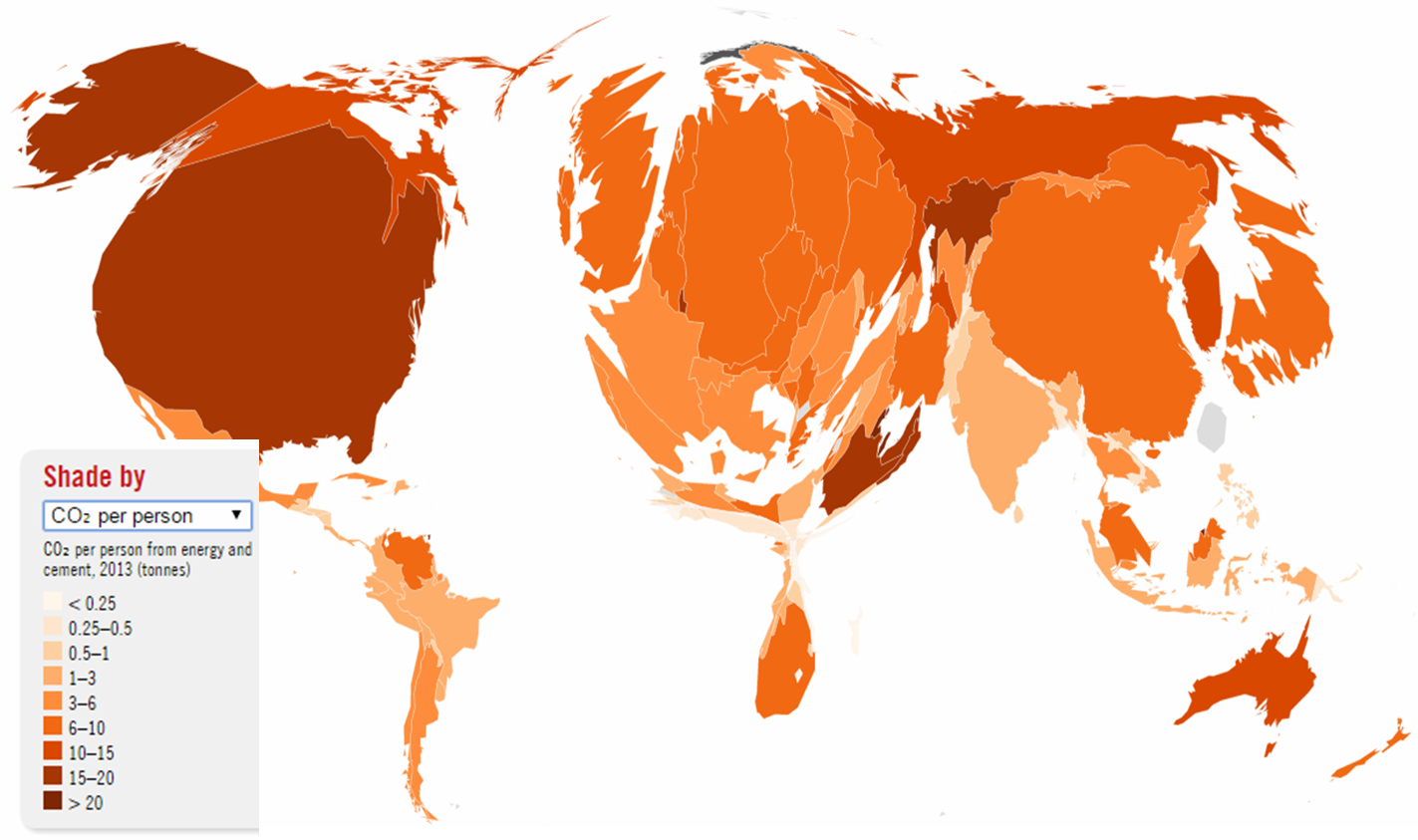
This map clearly shows that the US has clearly contributed the most to cumulative CO2 emissions and is still emitting the most per capita.
The metric we use here is cumulative carbon dioxide emissions from 1850 due to human causes coupled with a per capita carbon dioxide emission in the current period (2013). This puts the main causers of climate change as (1) The United States of America, (2) The European Union, (3) China and (4) Japan/India.
Next time the next step: Impacts of global warming

Pingback: Who caused climate change (and who should act)? | jpratt27